Why Customers Struggle With Menus and What Helps
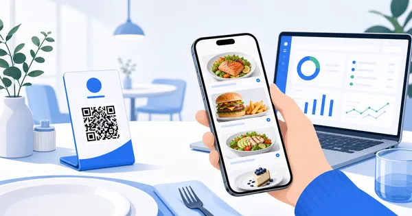
Restaurant guests often struggle with crowded menus, unclear choices, and missing visuals. A visual digital menu makes ordering feel easier.
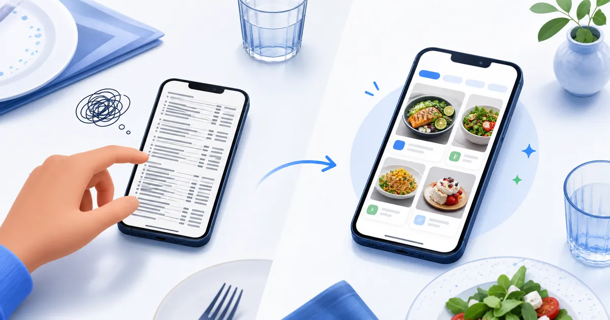
Most customers do not open a menu with unlimited patience. They are hungry, talking, watching the queue, or trying to choose before the server returns. When the menu is crowded, text-heavy, or hard to picture, ordering slows down. A visual digital menu removes some of the mental work between seeing an item and wanting it.
Too many choices create hesitation
Choice is useful until it starts to feel like homework. A long menu with similar item names can make guests second-guess themselves, especially when they are reading on a phone at a busy table. They scroll, compare, go back, forget what they saw, and eventually choose the safest dish.
Picture a Friday-night rush where table 4 has scanned the menu, but one guest is still moving between burgers, wraps, and loaded fries. The server arrives twice. The guest picks the regular burger even though a better-margin special was lower down.
That is not a failure of taste. It is a menu design problem. Good digital menus reduce hesitation by making categories obvious, highlighting likely favourites, and showing the right amount of information.
Text alone asks customers to imagine too much
Descriptions can help, but they also have limits. “House chicken salad with citrus dressing” may sound fine, but it does not show whether the dish is generous, light, colourful, grilled, creamy, or served with enough texture to feel satisfying.
Photos answer those questions faster. A customer can see the portion, style, and appetite appeal in a second. A dessert shop introducing a new pistachio slice, a cafe selling a seasonal bowl, or a takeaway promoting a family platter all benefit when customers can see what the words are trying to describe.
The easier a dish is to picture, the easier it is to order.
Confusing structure slows the table down
Many menus are organised for the business, not the customer. The kitchen may think in prep stations, stock groups, and internal categories. Guests think in moments: “I want something light,” “I need a drink,” “What is good for sharing,” or “Which dessert looks worth it?”
A visual digital menu can support that more naturally. It can group items by meal occasion, highlight specials, and use photos to separate sections without making the guest read every line. It can also keep practical details close to the decision.
Useful structure often looks simple:
- Best sellers near the top, not hidden in the middle
- Photos for unfamiliar or high-value dishes
- Drinks, sides, and desserts easy to reach from main items
- Sold-out items removed or clearly unavailable
- Short descriptions that explain the difference between similar choices
The goal is not to make the menu shorter at any cost. The goal is to make the path through it feel obvious.
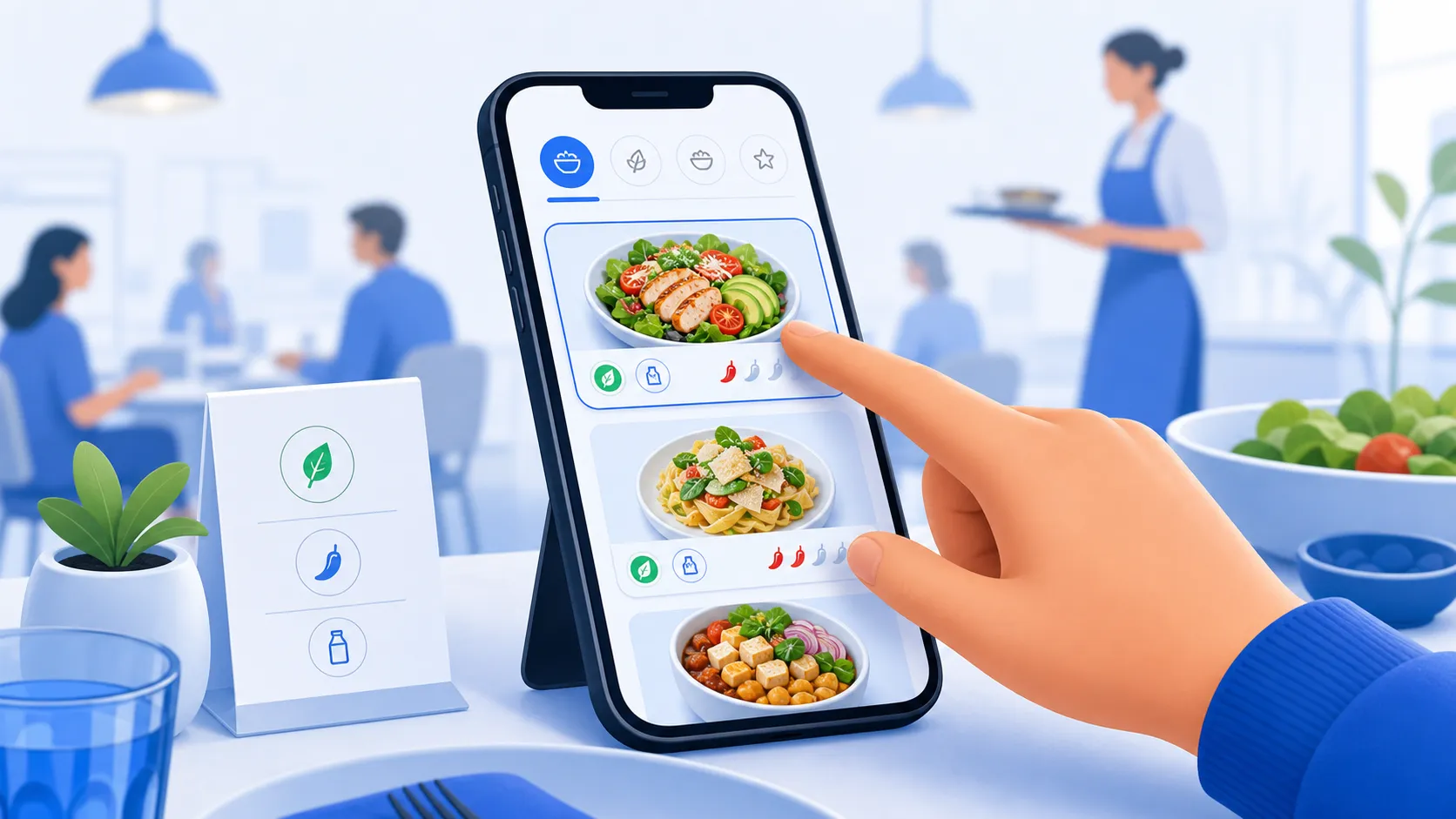
Visual menus reduce the need for staff explanations
Staff should still guide customers, but they should not have to rescue the menu all night. If customers constantly ask what a dish looks like, how big it is, or whether a sauce comes on the side, the menu is doing too little work.
This becomes painful during rush periods. A server explaining the same three dishes at five tables is losing time that could be spent taking orders, checking tables, and keeping service calm. A clearer digital menu handles common questions before they become interruptions.
That does not mean every answer needs a paragraph. Often the right photo, one better phrase, and a clear icon do more than a longer description.
Phone behaviour changes how menus are read
Customers do not read a phone menu like a printed one. They skim, tap, scroll, and compare in short bursts. A PDF or text-only page forces them into a slow reading mode.
A visual digital menu works better when it is designed for that behaviour. Dish cards, photo-led sections, quick category jumps, and clear spacing help customers orient themselves. They can move through the menu without pinching, zooming, or holding several options in their head at once.
This is especially important for groups. A clear mobile menu helps each person find their answer without turning ordering into a group project.
Better clarity can also improve sales
When customers struggle, they often become conservative. They choose what they recognise, skip extras, ignore dessert, or avoid specials that require explanation. That affects revenue quietly. The issue may not be that the item is unpopular. It may be that the menu never gave it a fair chance.
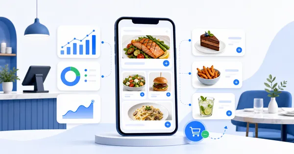
A visual menu can bring attention to the items that deserve it. It can show the seasonal drink beside brunch, place dessert where coffee decisions happen, or make a premium sharing plate look as generous as it really is. These changes are practical, not pushy. They help customers notice options they might genuinely enjoy.
The menu should make decision-making feel lighter
A restaurant menu has a difficult job. It needs to inform, persuade, organise, and reassure, all while the customer is hungry and distracted. If the menu makes people work too hard, the best dishes can stay invisible.
A visual digital menu helps by making the decision feel lighter. It shows instead of only telling, guides instead of overwhelming, and gives staff fewer repeated questions to handle. For customers, that means a calmer order. For restaurants, it means more of the right items get seen.
If your customers hesitate, ask questions, or default to the safest item, the menu may need more visual clarity, not more text.
Show dishes customers understand - turn your menu into a clearer decision path from the first scan.