How Branded QR Menus Make Small Venues Look More Polished
A branded QR menu helps cafes, bars, and takeaways look more consistent, memorable, and trustworthy from the first scan.
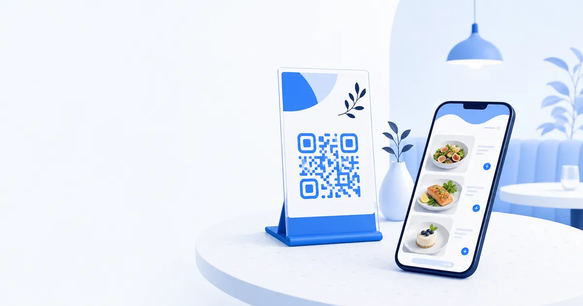
The first impression of a digital menu happens before anyone reads a dish name. It starts with the QR stand on the table, the screen that opens after the scan, and whether the whole experience feels like part of the venue or an afterthought. For small hospitality businesses, that moment matters more than many owners realise.
A plain QR code can make a good venue feel generic
Visit a stylish cafe with thoughtful plating, warm lighting, and a carefully chosen interior, then place a basic black-and-white QR printout in the middle of the table. The mismatch is obvious. The room says one thing, while the menu says another.
Customers may still order, but the experience loses polish. The menu feels borrowed rather than built for the business. That matters because guests are constantly reading signals about quality, even before the food arrives.
For independent venues, the digital menu is not separate from the brand. It is part of the setting, just like signage, packaging, and how the counter looks during service.
Consistency builds trust quickly
Branding is not only about looking attractive. It helps customers feel oriented. When the menu colors, imagery, and tone match the venue they are standing in, the scan feels intentional rather than risky.
That is useful in simple real-world situations:
- A customer at a dessert shop feels more confident scanning a code that looks professionally presented
- A wine bar can make featured categories feel more premium with the right visual treatment
- A takeaway counter can keep the menu clear and familiar across in-store, social, and QR traffic
The result is not flashy. It is reassuring. People understand that they are in the right place and that the business has paid attention to the details.
A branded menu does not add friction. It removes the feeling that the digital part was bolted on later.
Brand cues help the menu feel easier to use
Good branding is functional when it guides the eye. Clear section styling, consistent button treatments, strong food photography, and sensible spacing make the menu easier to scan on a phone. That matters when someone is standing at a counter with two friends behind them or trying to order quickly before a train.
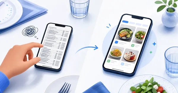
Imagine a small burger spot with signature items, kids meals, and late-night deals. If every section looks the same, customers work harder to find what matters. If the menu uses a clear visual hierarchy that matches the venue’s style, the path is faster and more natural.
This is especially important for businesses that rely on repeat visits. A familiar menu design reduces decision fatigue over time.
Small venues benefit because they cannot hide inconsistency
Large chains often get away with average digital experiences because their scale does some of the work for them. Independent venues do not have that cushion. Guests notice details more clearly, and every touchpoint carries more weight.
A compact coffee bar with a strong identity can gain a lot from:
- Matching the QR menu to in-store colors and presentation
- Using polished dish images instead of plain text blocks
- Highlighting signature items in a way that feels true to the venue
- Making specials and seasonal items look deliberate, not improvised
For a small team, that polish can change how modern the business feels without changing the room itself.
Branding also helps outside the table
The menu does not live only where the QR code is scanned. Customers may revisit it from a saved link, share it with a friend, or compare it with what they saw on Instagram. A branded menu creates continuity across those moments.
That is valuable for bars promoting event nights, bakeries taking preorder interest, or cafes pushing a new drinks range through social posts. When the visual language matches, the menu works as a proper extension of the business rather than a disconnected utility page.
Polished does not have to mean complicated
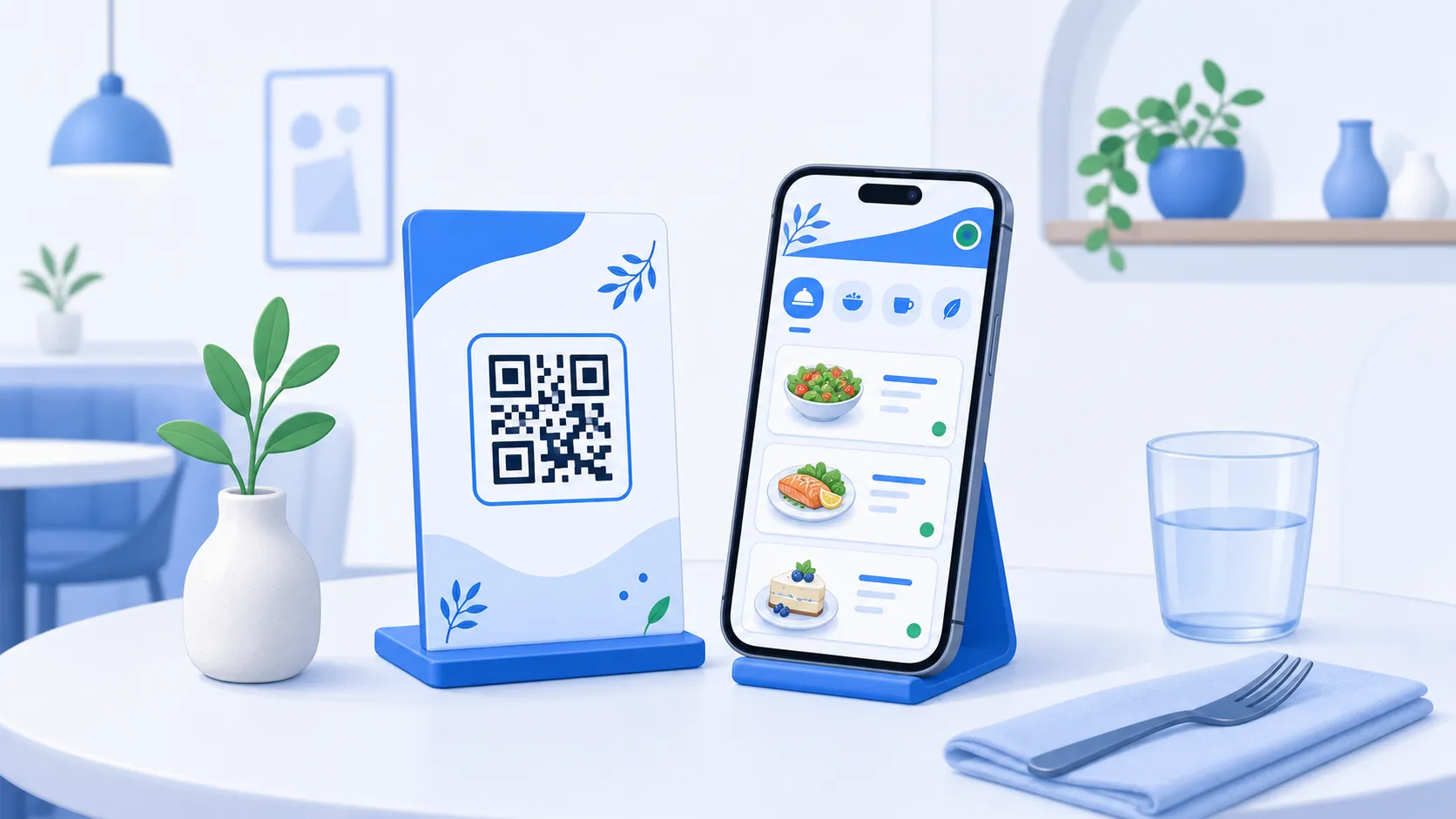
Many owners delay branding work because they assume it requires a designer, a full rebrand, or weeks of decisions. Usually it does not. The most effective improvements are simple: cleaner color choices, better dish imagery, consistent category styling, and a QR presentation that looks like it belongs in the venue.
What matters is that the customer feels a straight line from the table to the screen. If the venue feels calm and premium, the menu should feel the same. If the venue is playful and fast-moving, the menu should support that energy without becoming messy.
The scan should feel like part of the brand
Hospitality businesses spend a lot of effort shaping atmosphere, but the digital menu is often left looking generic. That is a missed opportunity. A branded QR menu can make a small venue feel sharper, more trustworthy, and more complete from the first interaction.
It is not decoration for its own sake. It is part of how customers decide whether the business feels current, thoughtful, and worth remembering.
If the QR code is the doorway to your menu, the experience after the scan should feel unmistakably like your venue, not a generic template.
Turn scans into brand moments - give your menu the same visual confidence your space already works hard to create.